
What Makes a Good Reference Photo for a Portrait?
Jul
Ever handed over what you thought was the perfect photo of Grandma, only to have an artist gently ask, “Do you have anything with better lighting?”
Well, you’re not alone if you’ve ever been through this.
Most of us are pretty good at spotting a cute photo. Fewer of us know what makes a paintable one. And honestly, those are two very different things.
A photo that melts your heart on Instagram isn’t always the one that translates into a stunning oil painting or a charcoal sketch.
So before you scroll through your camera roll and pick the first smiling face you see, let’s talk about what actually makes a reference photo “good” in the eyes of an artist, and why it matters more than you’d think.
Why the Reference Photo Matters When Creating a Painting
Every portrait begins with a reference photo. It isn’t simply an image for the artist to copy; it’s the primary source of information about a person’s features, proportions, expression, and personality.
The more clearly those details are captured, the more accurately they can be translated into a painting.
A common misconception is that a professional studio portrait automatically makes the best reference. In reality, that’s not always the case.
Studio photography often uses soft, even lighting to minimize shadows and create a polished look.
While this is flattering in a photograph, it can remove the depth an artist relies on to understand the structure of a face.

Painters use light and shadow to interpret form. Subtle variations in lighting reveal the natural contours of the face—the shape of the cheekbones, the bridge of the nose, the jawline, and the depth around the eyes.
These details help an artist create dimension and capture a stronger resemblance.
When lighting is too flat, overexposed, or too dark, many of these defining features become difficult to see.
Expression matters just as much. A genuine smile, a familiar glance, or a relaxed pose often says more about a person than a perfectly posed photograph.
These natural moments give a portrait warmth and authenticity, making it feel like the person rather than simply looking like them.
Ultimately, a reference photo influences every stage of the painting process.
A clear, well-lit image allows the artist to focus on craftsmanship instead of filling in missing details.
While experienced portrait artists can often improve or combine photos when needed, starting with a strong reference gives them the best opportunity to create a painting that truly reflects your loved one.
(Also Read: How to Create a Photo Diary)
What Should an Ideal Reference Photo Have?
Here’s the checklist most professional portrait artists swear by:
1. Sharp Focus and High Resolution
If you zoom in and the face turns into a blurry blob, that’s a problem.
A photo that’s been cropped down from a bigger group shot often loses the fine detail an artist needs, so start with the largest, highest-quality file you have rather than a heavily zoomed-in crop.
2. Natural, Directional Lighting with Real Contrast
Soft daylight from a window, or an overcast afternoon outdoors, tends to work best.
It creates gentle shadows that give the face shape and depth, rather than the flat, shadowless look you get from an on-camera flash or overhead fluorescent lighting.
A quick trick artists use: convert the photo to black and white in your phone’s editing app.
If you can still make out clear areas of light and dark on the face, the lighting has enough contrast to paint from. If everything blurs into the same gray tone, the lighting is probably too flat.
3. A Clear, Uncluttered Background
A busy background can distract from the subject and confuse the composition.
If your favorite photo has a chaotic backdrop, don’t worry; you can always remove background from portraits before sending it off, so the focus stays exactly where it should be: on the person.
4. A Genuine Expression, Quirks and All
Stiff, forced smiles rarely make for compelling art.
Look for a photo that captures a real laugh, a raised eyebrow, a thoughtful gaze, or a favorite bit of jewelry.
The small, specific details that make a portrait feel unmistakably them, rather than a generic likeness.
If teeth are showing, that’s fine too, as long as the smile still reads as natural rather than a stiff, camera-ready grin.
5. Straight-On or Slightly Angled Framing
Extreme angles (like a phone held way too high or too low, or a face turned so far it hides one side) can distort proportions and hide details an artist needs.
A relatively front-facing or three-quarter angle gives artists the most accurate sense of facial structure.
6. Good Color Accuracy
If a photo has a heavy filter or an odd color cast, it can throw off skin tone in the final painting.
A photo taken in natural light with minimal editing is usually your safest bet.
(Also Read: How to Choose the Frame for Art)
Single vs. Multiple Reference Photos
Here’s a question that trips up a lot of first-time buyers: should you send one photo or several?
The honest answer is that it depends on the photo.
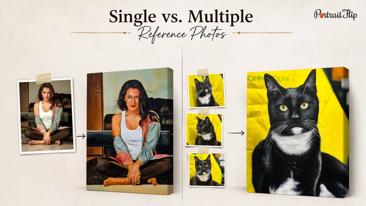
If you have one image that checks every box above, sharp, well-lit, great expression, a single photo can absolutely be enough.
Many stunning portraits are painted from just one great shot.
But if your best photo has a few flaws, let’s say, a lovely smile but so-so lighting, sending two or three photos gives the artist more to work with.
One might supply the ideal lighting reference, another the best angle, and a third the expression you love most.
Think of it like piecing together a puzzle.
This approach is especially handy for group portraits—a couple photo, a sibling shot with multiple people, or a family portrait—where different photos might capture different family members at their absolute best.
And once you find that one truly great reference photo, don’t feel like you can only use it once.
Many working artists return to a single strong photo again and again, adjusting the cropping, background, or color palette each time to create something new.
If you’ve got one image that nails the lighting and the expression, it can become the starting point for more than one piece of art.
What Happens If You Don’t Have a Good Reference Image?
Let’s be real: not everyone has a professionally shot, perfectly lit photo lying around.
Maybe the only picture you have of your late grandfather is a grainy, decades-old snapshot with a torn corner and faded colors.
Does that mean a portrait is off the table? Not at all.
This is where things get interesting.
A less-than-perfect photo simply means the artist or a photo editor beforehand, needs to do a bit more interpretive work.
Sometimes that means comparing your photo against similar reference images to reconstruct missing details, like an obscured ear or a shadow-covered eye.
It’s also why so many people turn to professional editing help before commissioning a piece.
In fact, some of the best photo retouching services specialize in exactly this kind of restoration, cleaning up scratches, correcting faded color, and sharpening blurry details so the final artwork has something solid to work from.
The takeaway? A flawed photo isn’t a dead end.
It just means you may need an extra step before the paintbrush ever touches canvas.
How PortraitFlip Can Help You Get Paintings With Old, Worn-Out Photos
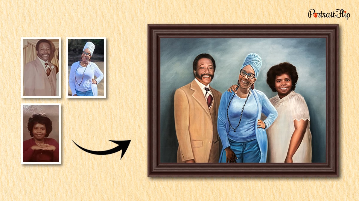
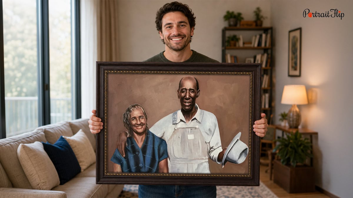
Old photographs carry a kind of weight new ones never will.
That faded, dog-eared picture of your grandmother at 25, or the only surviving shot of a childhood pet, deserves more than a folder buried on your hard drive.
If you’ve ever wondered what to do with old photos that are too precious to toss but too damaged to display, turning them into art is one of the most meaningful answers out there.
That’s exactly the gap our bad photo to painting service is built to fill.
Instead of relying purely on software to patch up scratches and pixel gaps, our real artists study your old photo, restore missing detail artistically.
Torn corners, water damage, faded ink—none of it stops the final painting from looking whole, vivid, and true to the person you remember.
It’s less “photo editing” and more “memory rescue,” and the result is a piece you’ll actually want framed on your wall, not tucked away in a drawer.
You can see the above examples and…
Conclusion
At the end of the day, a good reference photo isn’t about finding a perfect picture; it’s about giving the artist enough honest, well-lit, clear information to work their magic.
Sharp focus, natural light, a genuine expression, and a clean background will take you 90% of the way there.
And if your only photo is a little rough around the edges, that’s not a dead end; it’s simply a conversation worth having with the right artist.
Whether you’re commissioning a portrait of yourself, a couple, siblings, or a beloved photo from decades ago, the right groundwork now means a portrait you’ll treasure for years to come.
Frequently Asked Questions
1. Can artists work from a phone photo, or do I need a professional camera?
Modern smartphone cameras are more than capable, as long as the photo is well-lit and in focus. Professional equipment helps, but it’s not a requirement.
2. How many reference photos should I send for a portrait commission?
One excellent photo is often enough. If your best shot has minor flaws, sending two or three angles or lighting variations gives the artist more to work with.
3. What if my only photo of a loved one is black and white or damaged?
That’s completely workable. Skilled artists and restoration specialists can recover detail, add color, and reconstruct damaged areas so the final portrait still looks accurate and lifelike.
4. Does the background in my photo matter for a portrait?
Not usually, since most portrait styles isolate the subject anyway. A cluttered background just makes it a little easier if it’s removed or simplified beforehand.
5. Will a filtered or edited photo cause problems for the artist?
Heavy filters can distort skin tone and color accuracy. Whenever possible, send the original, unedited image alongside any edited version you love.
