
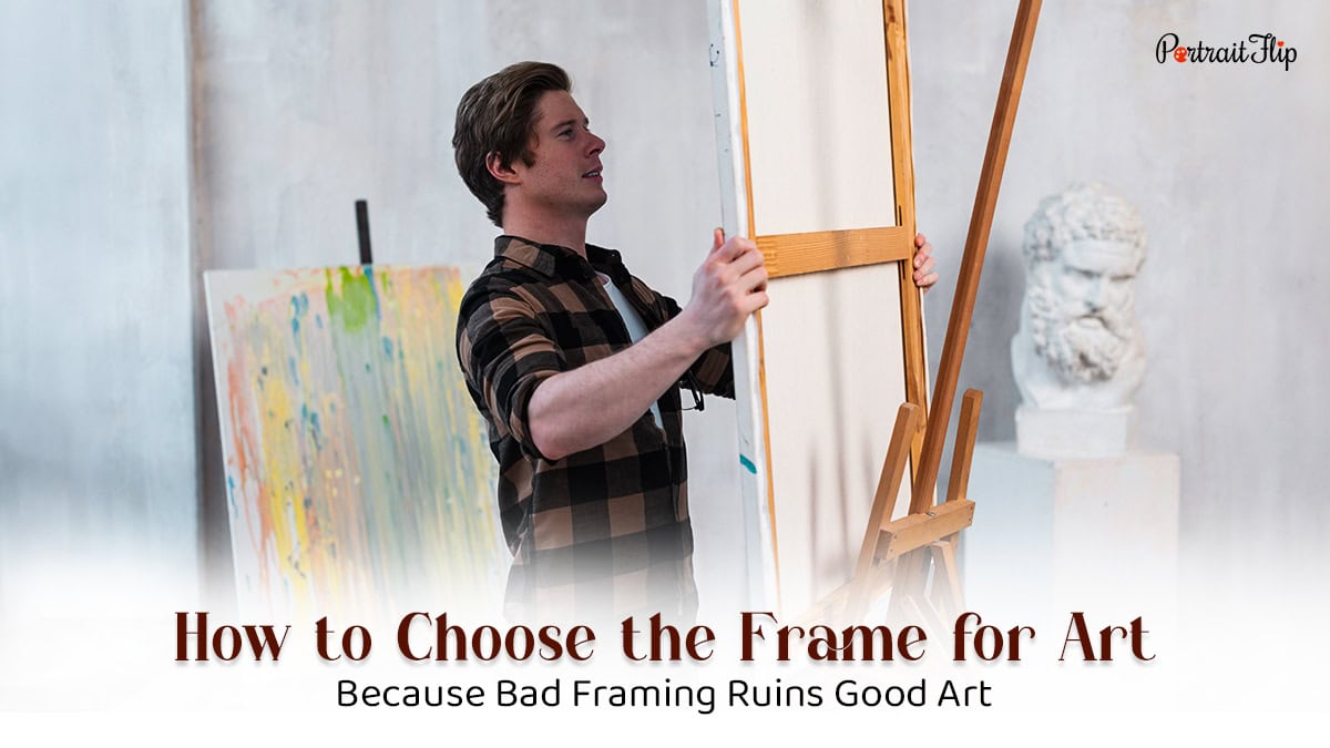
How to Choose the Frame for Art (Because Bad Framing Ruins Good Art)
May
Bad framing is everywhere.
Walk into any home, and you’ll spot it—a flimsy silver frame wrestling with a warm oil painting, a chunky ornate border suffocating a minimalist print.
Nobody intends for it to happen. It just does, because most people treat framing like a footnote.
It isn’t one.
The frame is a decision. A real one.
Get it wrong, and even a stunning piece of art looks like it belongs in a waiting room.
Get it right, and suddenly the whole wall, the whole room, snaps into focus.
This guide is about getting it right.
No guesswork, no vague advice.
Just what actually matters when you’re figuring out how to choose the frame for art so you walk away with something that looks deliberate, not accidental.

Why the Right Art Frame Actually Matters

Here’s the thing nobody tells you: the frame hits first.
Before anyone registers the brushstrokes, the composition, or the colors, they see the frame.
It’s the artwork’s introduction to the room, and a bad one poisons everything that follows.
A frame that clashes pulls attention toward itself.
One that’s too thin makes a bold painting feel timid.
Too ornate, and it swallows a quiet piece whole.
The frame isn’t supposed to compete with the art; it’s supposed to complete it.
And beyond looks, frames do real protective work.
Archival-quality frames use UV-protective glass and acid-free mats that keep artwork from fading, yellowing, or deteriorating.
If you’re framing something original or irreplaceable, that matters. A lot.
So no, framing isn’t just aesthetic. It’s functional. And it’s worth treating it that way.
(Also Read: Best Photo Tiles To Buy For Decorating Walls)
Things To Consider Before Choosing the Art Frame
Before you select the frame for your art, run through these. Skip even one, and you’ll feel it every time you walk past the wall.
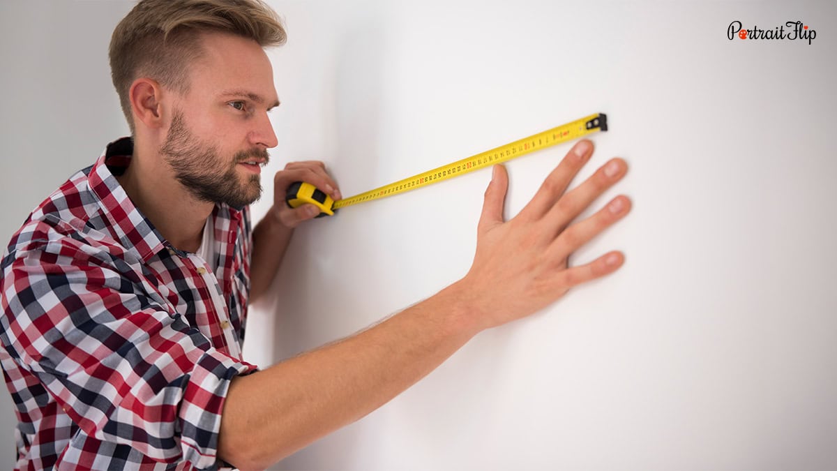
1. Size and Scale
Proportions matter more than people think.
A large, dramatic painting needs a frame with enough visual weight to hold it, something slim will look like it’s barely hanging on.
A small watercolor? The opposite.
Go delicate, or the frame eats the piece.
Measure everything before you shop—width, height, and canvas depth if it’s a stretched piece.
2. The Room’s Existing Style
Your frame doesn’t live in isolation; it lives in your home.
A rustic, wood-heavy living room and a minimalist modern apartment are not asking for the same frame.
Traditional spaces call for ornate, gilded frames.
Contemporary rooms want clean metal or understated wood.
The frame should feel like it belongs to the space, not like it crashed the party.
3. Material
Wood, metal, acrylic; each one speaks a different visual language.
Wood is warm and flexible; the same material reads differently in a dark walnut vs. a white-washed finish.
Metal frames (thin black, brushed silver) lean modern and clean which is great for photography and graphic prints.
Acrylic or plexiglass floats the artwork in a way that feels contemporary and airy.
Know the signal before you choose the material.
4. Color
Matching the frame color directly to your artwork is almost always a mistake.
Instead, pull a secondary or accent color from the piece and let the frame echo that.
Warm golden tones in a painting?
Try walnut or antique gold.
Cool blues and grays in a photograph? Matte black or brushed silver.
The relationship should feel intentional like the frame was chosen for this piece, not just grabbed off a shelf.
5. Mats
A mat is that border of paper or board between your artwork and the frame’s glass.
Most people skip it without thinking. They shouldn’t.
Functionally, it keeps the art from touching the glass (which causes damage over time).
Aesthetically, it gives the piece room to breathe; it draws the eye in and makes even a simple work feel considered.
Use mats for photographs, watercolors, and works on paper.
For canvas paintings, skip it.
6. Glass
Standard glass, non-glare, UV-protective, conservation-grade—the differences are real.
If your art hangs near a window or under strong lighting, UV-protective glass is a non-negotiable.
Non-glare glass handles overhead lighting without washing the piece out.
Conservation glass, which blocks up to 99% of UV rays, is the gold standard for anything valuable or irreplaceable.
Don’t cheap out on the glass for a piece you actually care about.
7. Budget
Custom framing is expensive. Off-the-shelf options are not.
The smart move is knowing which pieces deserve which treatment.
Casual prints and reproductions? Budget frames are fine.
Original artwork, cherished photographs, something that actually means something? Go custom.
A good frame for a meaningful piece is an investment, not an expense.
Does Your Artwork Even Need a Frame?
Not everything needs one. Knowing when to skip it is just as important as knowing how to select an art frame.
Gallery-wrapped canvases are built to hang without frames; the image wraps cleanly around the sides, and the edges are part of the presentation.
Adding a frame isn’t wrong, but it’s optional. Let the piece tell you.
Works on paper, drawings, photographs, watercolors, and prints almost always need framing.
Without it, they look unfinished, and they’re unprotected. There’s no good reason to skip the frame here.
Floating frames are worth knowing about, too.
They create the illusion that the canvas is suspended mid-air inside the frame—dramatic, modern, and especially striking for bold or large-format pieces.
And if you’re figuring out how to display art in home spaces that feel cramped or awkward, frameless and lightweight options can reduce visual clutter without sacrificing the impact of the piece.
The same logic applies when you’re thinking about how to hang a painting—the frame affects balance, weight, and placement on the wall, so factor it in before you pick up the drill.
The rule: let the artwork decide. Not every piece needs a frame. But every piece deserves a decision.
Get Framed Artworks For Your Home

Here’s where it gets interesting. What if the piece you’re framing isn’t a print you ordered online; it’s a memory?
A photograph tucked in a drawer for fifteen years. A blurry snapshot from a trip you’ll never forget. A picture of someone who isn’t around anymore.
These things deserve better than a basic 4×6 print behind cheap glass. They deserve to be art.
That’s exactly what PortraitFlip does. They take your photos, any photo, even bad ones, and turn them into hand-painted portraits by real artists working in real mediums: oil, watercolor, charcoal, pencil, etc.
Not a digital filter. Not an AI-generated print. An actual painting, made by a human hand, from something you already love.
The range is impressive.
A single portrait from one photo.
A compilation portrait that brings together multiple people or moments into one unified piece.
Paintings from blurry, low-quality, or damaged images are restored and rendered into something extraordinary.
And for anyone who wants to go all the way: royal portraits, where your subjects are reimagined in full historical grandeur.
When you frame something like that, a hand-painted portrait of your parents on their anniversary or a royal rendering of your whole family, you’re not decorating.
You’re building an heirloom.
And knowing how to frame art properly makes that heirloom look exactly as significant as it is. For painted portraits, a wide mat and a warm wood frame tend to land beautifully. For something more contemporary, a clean floater frame lets the painting command the wall.
The photograph was always worth more than a drawer. PortraitFlip just makes that obvious.
Conclusion
Framing isn’t an afterthought. It never was. It’s the decision that determines whether your art looks like it belongs in your home or like it’s still waiting to be unpacked.
Get the size right. Match the frame to the room, not just the artwork. Choose materials that mean something. Protect the pieces that matter. And if you’ve got a memory worth more than a print—get it painted.
Your walls should say something. Make sure the frame isn’t the thing that shuts them up.