
Contrast In Art: Your Guidebook to the Theory of Contrast
Oct
Vibrant shades of the color palette may leave you awestruck!
But when the colors and the underlying elements are arranged with each other with perfection, it comes out as a contrast in art.
One of the art principles and the most intriguing part of an artwork!
Contrast just adds a pop of color and effect to the artwork.
Not necessarily only a pop of colors but also a hint of emotions and values in an artwork.
Moreover, it is not limited to the activation of elements in a painting; it also focuses on the impact it creates on a painting.
Now that we have a hold of what the concept of contrast in art is about, let us read and learn more about contrast in art in depth!

Table of contents
What is contrast in art?

Contrast in art is a technique that involves placing dissimilar visual elements next to one another to intensify the qualities of the piece and give it more meaning.
Artists use a variety of tools at their disposal, including shadows, light, color, size, and composition, to create contrast.
Contrast is one of the best tools for engaging a viewer and generating meaning within a single work of art, and has frequently been referred to as the “golden rule” of art-making.
But what makes contrast in art stand out?
Well, its ability to stand out from the other principles of art and its ability to support the color palette as well.
Basics of Contrast in art

Many people view contrast as the supreme creative principle in all of art.
Contrast in art is closely related to variety and is essentially defined as the pairing of disparate elements to intensify their respective qualities.
It is used to establish rhythm or to sharpen the focus of an artwork by experimenting with the placement of opposing elements such as light and dark, the opposite colors on the color wheel, texture, and size.
Contrast in color is also apparent if an artist plays with color, particularly complementary color combinations.
They are the ideal examples to demonstrate color contrast because they are situated directly opposite one another on the color wheel.
Types of contrast in art
Do you wonder what is it for contrast to get distributed among the art niche?
Whether it be colors, shapes, space, etc. contrast can be used effectively with any element of art.
Contrast in Art can be of various types but when you stagger it down to some focused art principles and elements then contrast in art is of 4 types.
It is purely based off on the value, color, texture and shapeTe.
So, without any further ado let us jump right into the types of contrast in art.
Suggested Read: Repetition in Art
Value Contrast
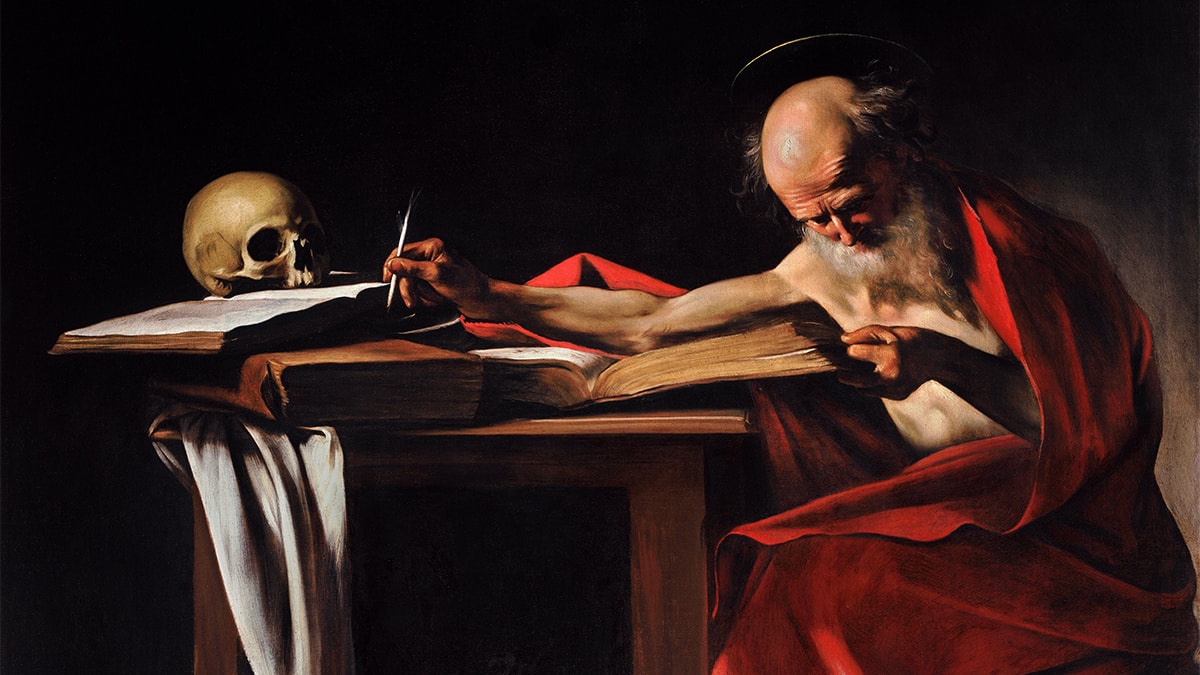
A effects of light and dark shades of the color surely plays an important role in adding the value contrast to an artwork.
To explain this concept of value in contrast I would like to tell you that the famous effect of chiaroscuro, that can often be seen in the paintings by Caravaggio is a prime example of value in contrast.
Clearly saying, added value in a painting with contrast can help you in adding depth, drama and movement in a painting.
You can observe that by the use of colors and irrespective of the hues, the objects in the painting can be given an effect of motion.
I hope that this concept of value in art must be clear to you, now moving on to the next type of contrast.
Color Contrast
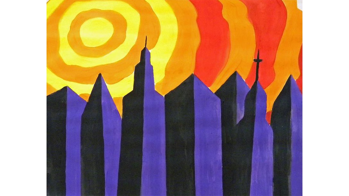
Color! one of the most important tool and element an artist needs to complete their painting.
Color contrast can be used to make the painting or the artwork more intriguing by adding the pop of tonality and by experimenting with the color palette.

When we talk about the colors that an artist use in their painting is to add more meaning to the artwork.
For example if you come across the painting of a war-zone and the artist has used the colors like red, brown and black, then you can actually sense the meaning behind the painting.
When complementary colors are juxtaposed in the same creation it adds more contrast and depth to the painting.
Texture Contrast
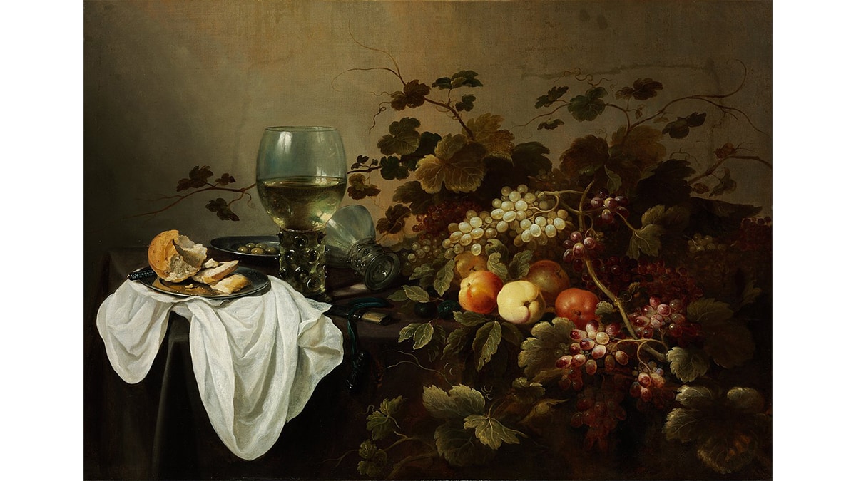
Texture? The word definitely sounds familiar, right?
When texture is added to any painting or artwork it adds on to the depth and impact of the artwork.
Primary question that often strikes in our mind is what exactly is texture in contrast and how can it be added to an artwork?
Well, you can observe in some of the paintings that it has a smoother background and textured or rough surface and it only adds in the beauty of the surface.
There are many prime artworks and they are literally some of the famous paintings of all time that has been used to depict the concept of texture in contrast.
Shape Contrast
It is a basic learning that shapes are one of the most important aspect of an artwork.
Without shapes and structures there’s no meaning to an artwork.
Shape contrast means that when you add shapes, lines and structures to a painting either uniformly or randomly.
That is when you notice that shapes when arranged in contrast do add a depth in the artwork and it also helps the painting in looking more systematic.
Artworks Showcasing Contrast in art

When you take a look at the artworks that are created by some of the most famous painters of history, then you can see the use of a lot of art elements and principles.
For example when you take a look at the Guernica by Pablo Picasso, you can see that Picasso has used a lot of shape and color contrast in the specific artwork.
And at the same time when you look at the painting by Johannes Vermeer, The Girl With a Pearl Earring, in that image the use of texture in contrast is very prominent.
Also, Starry Night by Van Gogh, St. Matthew Calling by Caravaggio, etc these all are some of the famous artworks that showcases the use of contrast in art.
Conclusion
When any concept related to the art elements and principles gets discussed, they each have their own individual importance.
People often sideline or skip one or the other elements of art, but at the end of the day, you cannot complete an artwork without the elements and principles of the art.
Whether it be some of the famous paintings of history or the paintings of modern art, you can identify the various elements of art.
Elements of art really play an important role in maintaining balance in art.
We at PortraitFlip strive by the same rule that we maintain the quality of the painting and also do not compromise with the elements of the art.
So, what are you waiting for?
Author’s Epilogue
If you are still here, then thank you so much for staying till the end!
This was all about contrast in art.
We try our best to provide you with the most refined and researched information, so if you find this blog helpful, then do leave your valuable feedback in the comments.
Also, we are active on social media platforms and post fun content there; say hi to us on Instagram or Pinterest.
We are actively posting on YouTube, so don’t forget to subscribe <3
See you soon; till then, stay hydrated!
Bye bye!
FAQs
Contrast in art is important as it adds emotion, value, texture and a pop of color to the artwork. In short, it adds life and meaning to an artwork.
Contrast in color is the effect when the background and the foreground color complement each other and can be seen complementing each other on the color wheel.
The term contrast is derived from the Latin terms “contra” and “stare,” meaning “against” and “stand.”