
Color in Art Explained: The Ultimate Guide

Feb
When you look at any work of art, what is the one aspect that cannot escape your eyes? Well, it’s none other than colors..!
There is nothing that escapes color in the world we live in.
Anything around us that is hit by light will carry a certain color of its own.
Think about it, color even has a huge role in helping us perceive and understand the world better..
Colors have a unique way of communicating because of its ability to represent different emotions.
That’s why color in art also stands as the most important element out of seven art elements.
Therefore, art you have witnessed so far, has specific colors in it, done professionally and purposely by artists.

It either connected with the artist, or it served the purpose that the artist envisioned in the first place.
Either way, there wouldn’t be any art without colors. Let me ask you: could you imagine a world like that?
I have dug a bit deeper and made a little guide for you to understand color in art!
But let us start at the basics, what does color in art mean?
Table of contents
What is Color in Art?
Color is something that we all know so organically, but what exactly is the definition of color?
In scientific terms, color is understood as light touching any surface to create a color and reflecting it back to the eyes.
When the eye catches light the photoreceptors in our eyes called rods and cones identify the color that we see.
But then how do we see different colors if it is the same process for each color?
This happens because of different wavelengths that exist in light which produces different colors.
If you think about it, how an individual perceives color is always a very personal and unique experience.
And we already know that perceiving art is also a personal experience.
So, is it even surprising that color is one of the most important parts of any artwork?
Even in monochromatic art, a painter cannot escape colors because they would be working with one or two major colors.
This element of color in art works as the catalyst and a guiding inspiration at the same time for the artist.
Color, again, is a whole spectrum that is used and manipulated in different ways by the artists and the spectator.
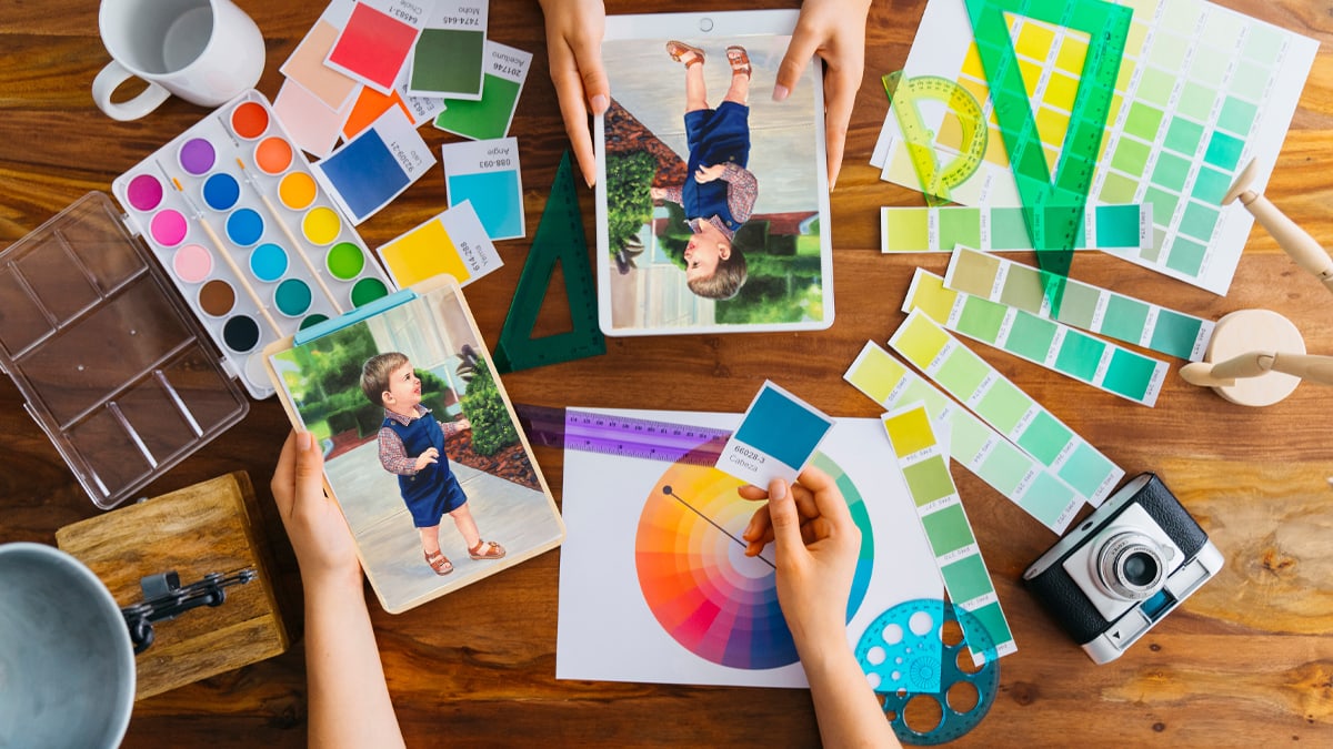
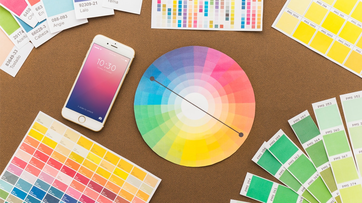
The best way to understand this spectrum would be to look into color theory and the color wheel which encompasses everything you need to know about colors!
Introducing the Color Wheel
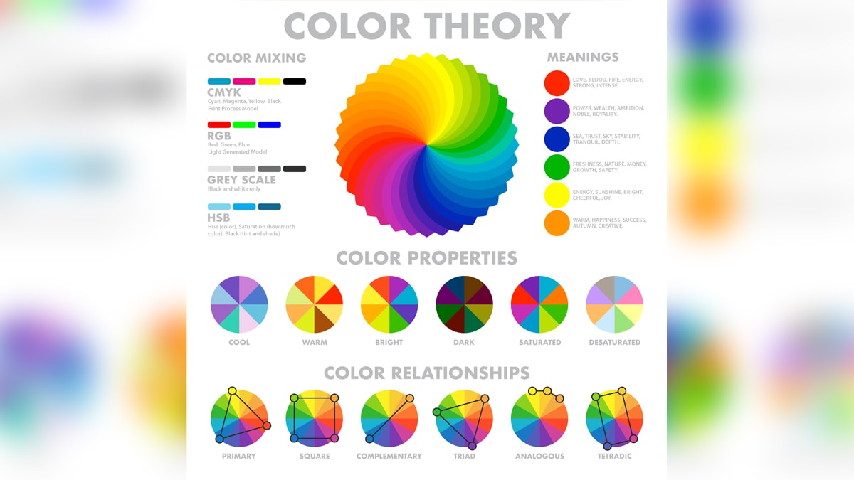
Did you know that it was Sir Isaac Newton who invented the color wheel in the 1600s?
The above image represents the color wheel, and of course, it includes all the colors to exist.
To understand color in art, what matters is how you perceive the wheel and what you choose to focus on!
For example, in a glance, the first observation you can make is that the colors are identified as VIBGYOR.
Violet, Indigo, Blue, Green, Yellow, Orange and Red; yes, we are all aware of what is also known as the rainbow colors.
The second distinction you can make in the color wheel is that it is divided into two parts—warm and cool colors.
And then we further recognize the primary, secondary and tertiary colors.
Wondering what are they?
- Primary Colors in Art: Blue, Red, Yellow
- Secondary Colors in Art: Green, Orange, Purple
- Tertiary Colors in art: Red-orange, Red-purple/ violet, Yellow-green, Yellow-orange, Blue-green, Blue-purple/violet.
It is vital to understand that primary colors act like the building blocks of the color spectrum.

If you break down the colors, you will end up with one of the three colors.
And if you combine the primary colors, you can end up creating several new colors!
There are many famous artists who only worked with the primary colors for their artworks, which is highly celebrated.
Color Schemes
In simple terms, the color scheme is nothing but different color combinations made from the primary colors.
This is where the terms complementary colors and analogous colors are also introduced, as they are the most common color schemes.
Split-complementary and triadic, square and tetradic are also some other combinations that create schemes.
Complimentary colors are often opposite colors that go well together as a pair, and as the name suggests compliments each other.
Meanwhile, analogous colors are those colors which are very close by in shades but still go well together!
Suggested Read: Function of Art
Color Intensity
The color intensity in the color wheel is what we understand as “saturation” or “chroma”.
Saturation is like a scale that decides the “warmth” and “coolness” of a color.
It also decides what shade of color is bright or dull.
While looking at color in art, color intensity is important to understand how to mix colors to increase or decrease its brightness.
Suggested Read: Understand the Definition of Line in Art
Color Temperature
While discussing color in art it is impossible to not look at color temperature.
But what does color temperature mean?
We already know that there are warm and cool colors, and the scale that holds these colors together is called color temperature.
Artists across the world also use color temperature to convey emotions in their artworks.
For example, Pablo Picasso’s “blue period” consisted of a series of paintings that reflected his despondency and misery!
So, technically, it sets the “mood” to any painting.
Even if you are not an artist, I urge you to think of colors with respect to their temperature; what is the emotion you associate with each color?
While with red it is often love or danger; with yellow, it is either happiness or feeling mellow. These are warm colors.
Same way, blue and violet represent sadness and rage respectively. These are cool colors.
To Conclude: Different Color Terminologies

Now that we know about the color wheel and its significance on color in art, I’d like to add a few more important terminologies.
I am sure you have come across these terminologies that are connected to color in art, but I wonder if you know the real meaning associated with them.
- Hue: Hue is often described to be the “dominant” color in any artwork you notice. Now while this term has been often used as a synonym of color, you need to understand that “color” is a broader spectrum. Whereas, hue focuses on the main or dominant color of something.
- Tone: You’d be surprised to know this but tone refers to any color which has a hint of gray mixed in it. Yes, it is not any color but gray which is a mixture of black and white.
- Tint: When the color white is combined with any color, that is called “tint”. What is commonly known as pastel colors are in fact tinted colors.
- Shade: Shade can be considered the opposite of tint. Even though we use terms like “a shade lighter or darker’, shade is defined to be the color formed when it is mixed with black.
Wait a minute…
Yes, I know what you must be thinking—but don’t we all use these terminologies as synonyms of color?
You’re right, we do. But now you know what is the exact definition of each, and it also makes sense why they could also be used as synonyms for different colors.
I hope that this has intrigued you enough to ponder more over colors and the different sides to them.
Color in art is one of the important elements which can instantly catch anyone’s attention.
That said, the next time you come across a painting or artwork, I hope you spend some time studying their colors and the meaning behind them too.
Until then, I will see you in the next one.
Cheers!
Frequently Asked Questions
Color in art brings immediate emphasis on the subject matter in the artwork. It also helps in conveying various emotions and viewers perceive art in a better way.
It is vital to understand the color theory to properly use the color wheel and combine colors while creating art.
We all know primary colors can be used to make secondary and tertiary colors by mixing, but mixing these other colors cannot create primary colors.